Thursday 21 January 2016

Returning to Mark Making and finding William Platz

William Platz - Some Candy Barbara - part of a project
Where as previously I draw on to just a pure white surface I now work with a range of surfaces, some of which are marked and it has pulled me more towards the question of the mark itself. Much of my previous work on canvas, before the MA, had evolved around mark making and the process. The mark was the element that matter rather than the detailed whole.

So I have began looking at artists who question the nature of drawing and my lead into this is an artist called William Platz. He is a reletively unknown pratcioner professor based in Australia but engages with life drawing and questions the actual process of drawing mixing it with film and performance.

William Platz - Some Candy Barbara - part of a project
The intense presence of his models and the way in which he interacts with them is visually powerful, the lines and marks are raw and exposing. The works he produces are often engaged with a pedagogy or academic interrogation of the understanding and teaching of drawing. Looking at his work I realize now I need to re-examine the process of drawing I have been going through and potentially implement new systems or events at which I can 'collect' imagery. This could be photos, film or drawing or a collective of all of these things. I am going to further study his work.

Monday 11 January 2016

Field Studies


I was looking to source imagery for the my illustration of Ted Hughes poem's and so one of the places I have looked is out in nature, seeing this is the subject of Hughes's work. Going on a series of walks in the countryside to observe and see what I could take from the experience was and still is one of the processes I use to source content.

I took a series of photographs.


One of the things that struck me was the shapes of the actual earth in the field. The patterns and textures, browns and greys. One of the concepts I played with was taking strips of the brown earth, cut them into rectangles, and try to extract the shapes of the clods. But on some level this seemed disingenuous to the actual location and perhaps too abstract to use in the final work.

I could use these images as backgrounds for my drawings, the question of backgrounds having been prominent in my latest studies. Potentially these fields of brown could be abstracted and worked up as grounds to draw upon, but would this have the same effect as my abstract drawings of the clods of earth?

Further development

I plan to take more photographs of the landscape and more importantly some of the individual 'characters' within it, such as the trees and birds. These are the elements that at the moment make up the core messages and narrative of my illustration. I may also source the colours from these images, although at the moment I am using black and white.

Sunday 3 January 2016

Reflective Blog Post


The starting point for my research and practice has been a 
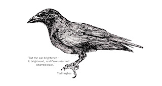
collection of poems called Crow by Ted Hughes, illustrated by the artist Leonard Baskin. Hughes's gritty poems and Baskin's dramatic wood block prints seemed to drive to the core of something bleak in nature which appeals to my sensibilities. But more their combination also reflected a powerful symbiotic working and understanding that so enhanced the project and questioned the role of illustrator.

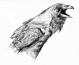
I began to try and create my own versions of the crow. I drew using ink as a mirror to Baskin's technique and sought ways of manipulating the crow's image into something obscene, trying to reflect the words of the poems. But on some level this didn't work for me and the illustrations I preferred were very much closer to the original image of the crow and relied more on an aggressive posture of the bird, in the chosen photograph. I looked at other Illustrators experiences such as Lord's A Journey of drawing an illustration of a Fable for insight.
 
But in what respect did this reflect the status of illustration today? Delving deeper into what Illustration is perceived to be (the book The Education of an Illustrator being of particular interest) and an area that is much discussed today, I recognized the concept of Illustrator as Author and that on some level Baskin was embracing. The boundaries between the ownership, or originality, of the visual imagery of the illustrated words was blurred. An illustrator could quite easily own the visual language of a text more convincingly, than the writer, despite the work being their original concept. 


I saw this could create a confused identity for the Illustrator, through my own drawing and reading texts like The End of Illustration by HELLER . When did their work move from being a work of art to an illustration? How much ownership of the visual concepts did they have when working on illustrating a text? For me the prints by Baskin exist separately from the words but so clearly illustrated the meaning of the poetry, which also reflected an unfathomable nature.

 
I felt like I had to grasp more of the narrative of the poem though text like The Author/Illustrator by Brodner informing my practice and decided that I would try and present a whole poem through one illustration. I produced a series of studies that I combined in one image depicting the poem Crow's Fall by Ted Hughes. I supported the content through walks in the country and a trip  to a zoological museum, my own photographs and range of secondary sources.

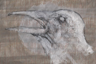
I stood before the black and white Illustration of the work and felt that something was missing potentially. We then had a workshop with Kerry Andrews where we looked at grounds on to which we might work and I began a series of studies of a range of mid tone papers. I also found the alabaster drawings of Tacita Dean inspiring. I worked up grounds, painting on mid tones and effecting the crow with white paint. For me at this point they engage with the question of what is an illustrator and when does a work become an illustration, but also they reflect something primal that the words of the poem embody.


Friday 1 January 2016

Tring Zoological Museum and Stuffed Crows


I have naturally been seeking a range of sources for my illustration. So far I have drawn crows from photographs I have sourced online and winter fields from photographs I have taken in the countryside. But I have been looking to work from taxidermy crows and have been looking online to purchase one. Yet, I wondered if this would be the same when the high resolution photographs, I have been working from, show something living (the life and energy obvious) and often in dramatic poses. So would working from a stuffed animal feel the same or inspire such works? One place I went to look into this in December was the Tring Natural History Museum. I thought it a better idea to actually see some stuffed crows before I bought one.

The Tring Natural History Museum has an extensive collection of stuffed animals. I sought out the crow family and knelt before the glass staring at their lifeless status. Never have I felt so disappointed with my subject matter as then as I stared at the awkwardly posed birds. Not only were their eyes totally wrong, which is what I kind of expected, but their features seemed unnatural, their positions wrong and the sorry quality of their overall presence was like a diminished light. These weren't the powerful creatures I expected more sorry uninspiring replicas.

I stood back and realised that these were not the crows from my drawings or the beautifully grim birds that Ted Hughes talked about in his poetry. I resolved that I would need to photograph or draw from live birds.

Tring Natural History Museum - The Walter Rothschild Building, Akeman St, Tring, Hertfordshire HP23 6AP

PLEASE NOTE: The Tring Museum is a wonderful and inspiring place and as I witness some specimens are showing their age. I highly recommend a trip there despite this experience as they have thousands of great taxidermy animals and the place is a national gem.